
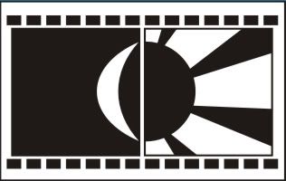
The first design is done by taken ideas from a filmreel nagative fimroll. I also use some effects to make readers think this is about a post-production company . The Sun represents effects and the Moon represents the Sound, both of them are important parts of the post - production company. After vectorising it, I realised that this design suits for a banner of their website, not the logo. So I used the idea and make this :

This time it looks better, but I was not satisfied because it looked complicated, not simple. So I tried another design :

This looks better and simplier. The ideas behind is still the same. ( =)) ) This can be the final design based on the original ideas.
After making this, I tried another ideas and came upwith this :
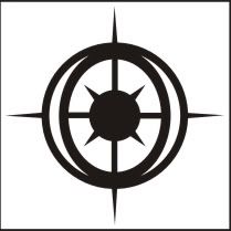
The Sun is based on a sniper scope that we often see in movie ( actually they are effects from the post production process ). The Moon make it looks like an eye when I place it like this ( but we cannot see the moon clearly anymore ), the eye is watching something coming up like we see in action movie ( a bullet or an arrow flying - they are effects too )

These are my design. Fell free to give any comment you have. >:)
1 comment:
I m quite like the fist one. It sticks to the main requirement (logo for post production film company and actually the Sun has nearly the same the design of mine).
The second is quite emotional and the third and fourth one are too abstract.
Post a Comment