Sunday, September 14, 2008

Random Drawing


I always love manga and anime. I have tried to draw so much and now, I have a little confidence in my drawing skill.
this is just a random picture I drew when I have free time. I cannot edit this picture in Photoshop much because I don't have enough time ( because of the deadline ) :D
Feel free to give some comment.

Wednesday, August 20, 2008


This is the poster for Simu Market - an upcoming event in RMIT University. I am the one in charge of design this poster.
The idea is simple. The purpose of this event is the competition between 8 business teams, so I take the world as the biggest market battlefield.
To create this poster, I search for a picture of the earth, then create a clouded background with Photoshop function. After that, I use radial blur and gaussian blur; then add the money symbols and countour them.
Finally, I add the text. That's all.
Feel free to give any comments. thanks for reading

Tuesday, August 19, 2008

Where are your recent posts?

Sunday, July 27, 2008

The Sun


I want to make a illustration series of Tarot Cards, so I end up creating this image. This is "The Sun" card, last time is "The Death" card.
The ideas is simple, just showing what the sun looks like. I used graffiti style to create this.
This image is done within a short time when the idea came out so it may look simple.
Feel free to give me any comment.

Friday, July 18, 2008

DEATH

This is just a random image created by me. As you can see, my playlist this week is all about death metal. So after listening to them, I want to create a poster for celebrating death metal >:)


The idea is simple, just show everybody the scariness of death, also bring out the darkness of death to the world.
I use Photoshop to combine lots of images ( royalty free of course ) to create this.
This is just a simple work, feel free to give me comment.

Sunday, July 6, 2008

Assignment 1

My chosen designer : Steven Heller
3 of his works will be updated soon !

Wednesday, July 2, 2008

Sun & Moon >:)

This is my design for a post production company as a part of my exercise in class.


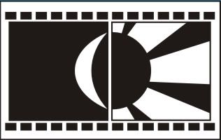
The first design is done by taken ideas from a filmreel nagative fimroll. I also use some effects to make readers think this is about a post-production company . The Sun represents effects and the Moon represents the Sound, both of them are important parts of the post - production company. After vectorising it, I realised that this design suits for a banner of their website, not the logo. So I used the idea and make this :


This time it looks better, but I was not satisfied because it looked complicated, not simple. So I tried another design :


This looks better and simplier. The ideas behind is still the same. ( =)) ) This can be the final design based on the original ideas.

After making this, I tried another ideas and came upwith this :


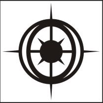
The Sun is based on a sniper scope that we often see in movie ( actually they are effects from the post production process ). The Moon make it looks like an eye when I place it like this ( but we cannot see the moon clearly anymore ), the eye is watching something coming up like we see in action movie ( a bullet or an arrow flying - they are effects too )


These are my design. Fell free to give any comment you have. >:)

Friday, June 27, 2008

BLOG STARTS !!!

Hello ! I'm BlackAbyss from BlackClan !

... Testing ...

............ System all cleared ...............

....................... Start testing .......................

Black
Green
Red
Blue
Yellow
White